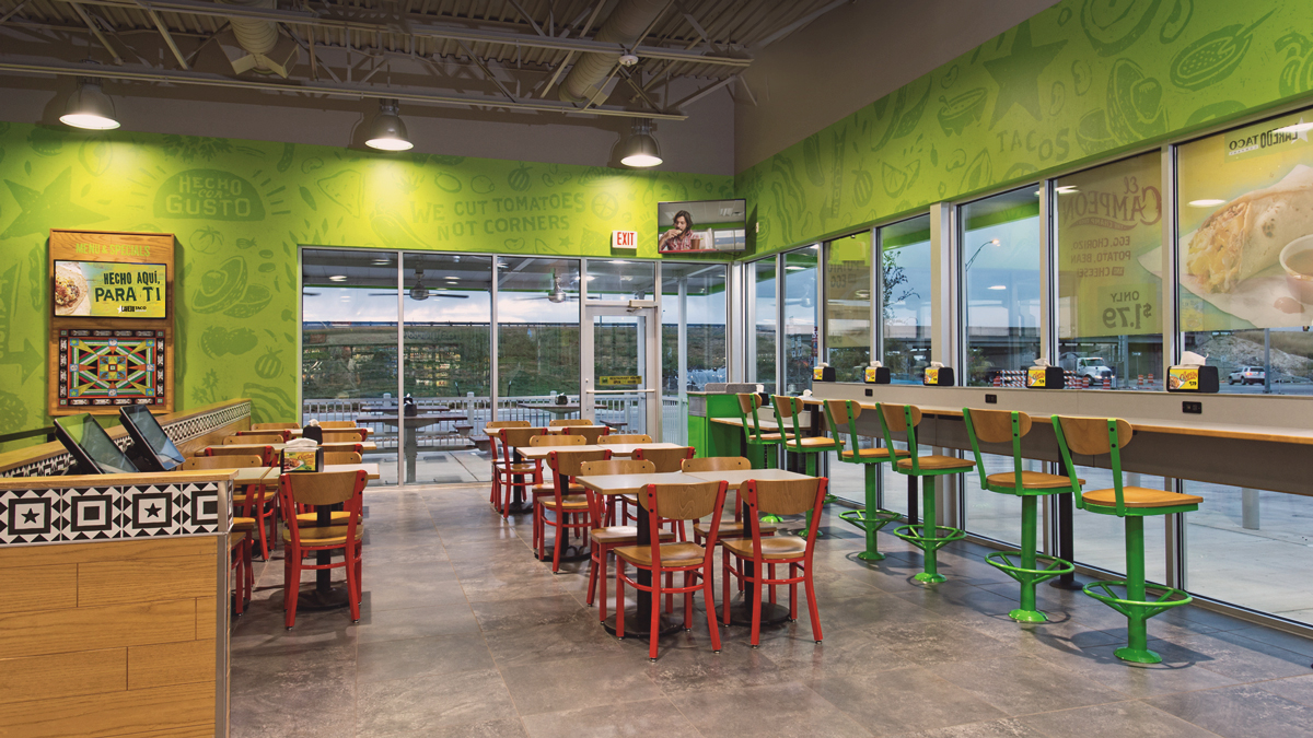
At Laredo Taco Company (LTC) authentic Tex-Mex reigns supreme. A place where customers can “fill up” their stomachs, coolers, gas tanks, all in one stop. Known for their border-style flavors and fresh ingredients wrapped in a one-of-a-kind hand-rolled tortilla, even Anthony Bourdain approves.
As Lead Designer on this QSR account, I was responsible for creating the vital brand components: foundation for the visual identity, templates and design guide, and various brand campaigns throughout the year. In this process, I managed and mentored art direction to external freelancers, producers and designers for design delivery. After a full year of the rebrand, LTC sales increased 5.2% and continued to improve month to month. A/B testing and retargeting strategies tested, lowering cost per acquisition by 8%.
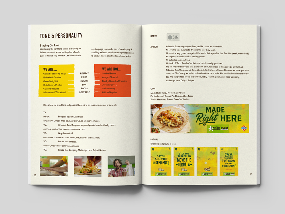
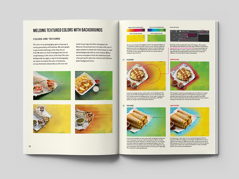
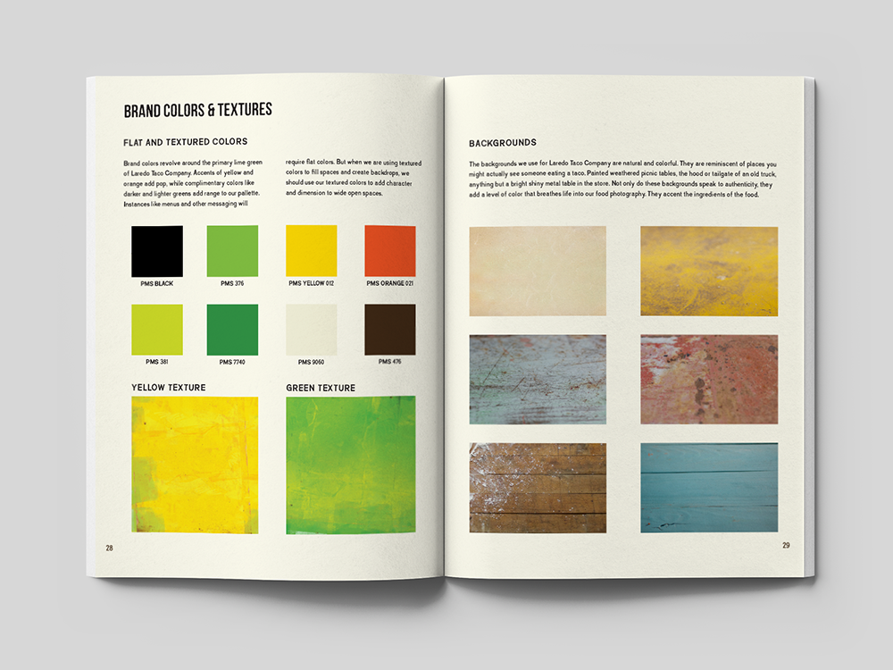
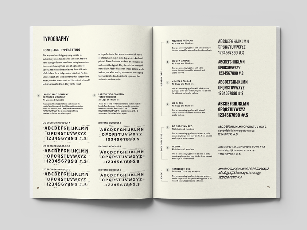
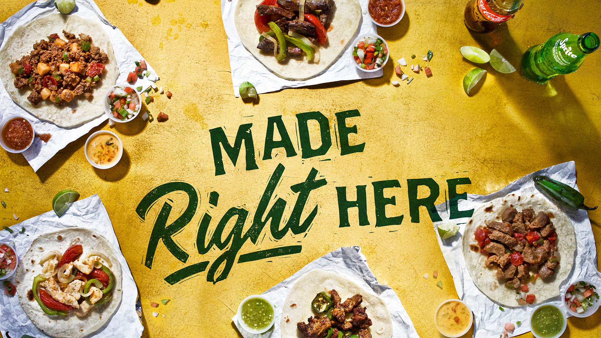
The brand voice is upbeat–bold headlines showcase the brand’s personality, communicating LTC’s passion and commitment to authentic tacos; they’re strategically placed over vibrant color blends to compliment the food photography. Custom typography, inspired by woodcut / linocut art, reflects the same handcrafted care LTC puts in their food.
Range of creative brand pieces—across in-store PoS (point-of-sale), digital and social media. Visual identity brand featured across 450+ stores reaching 1K+ hungry customers across state borders.
Role
Account Lead Designer
Team
Creative Director: Jose Canales | Copywriters: Erika Gilbrech, Gabe Guerra Food Photography: Jody Horton